2015 Congressional Art Competition
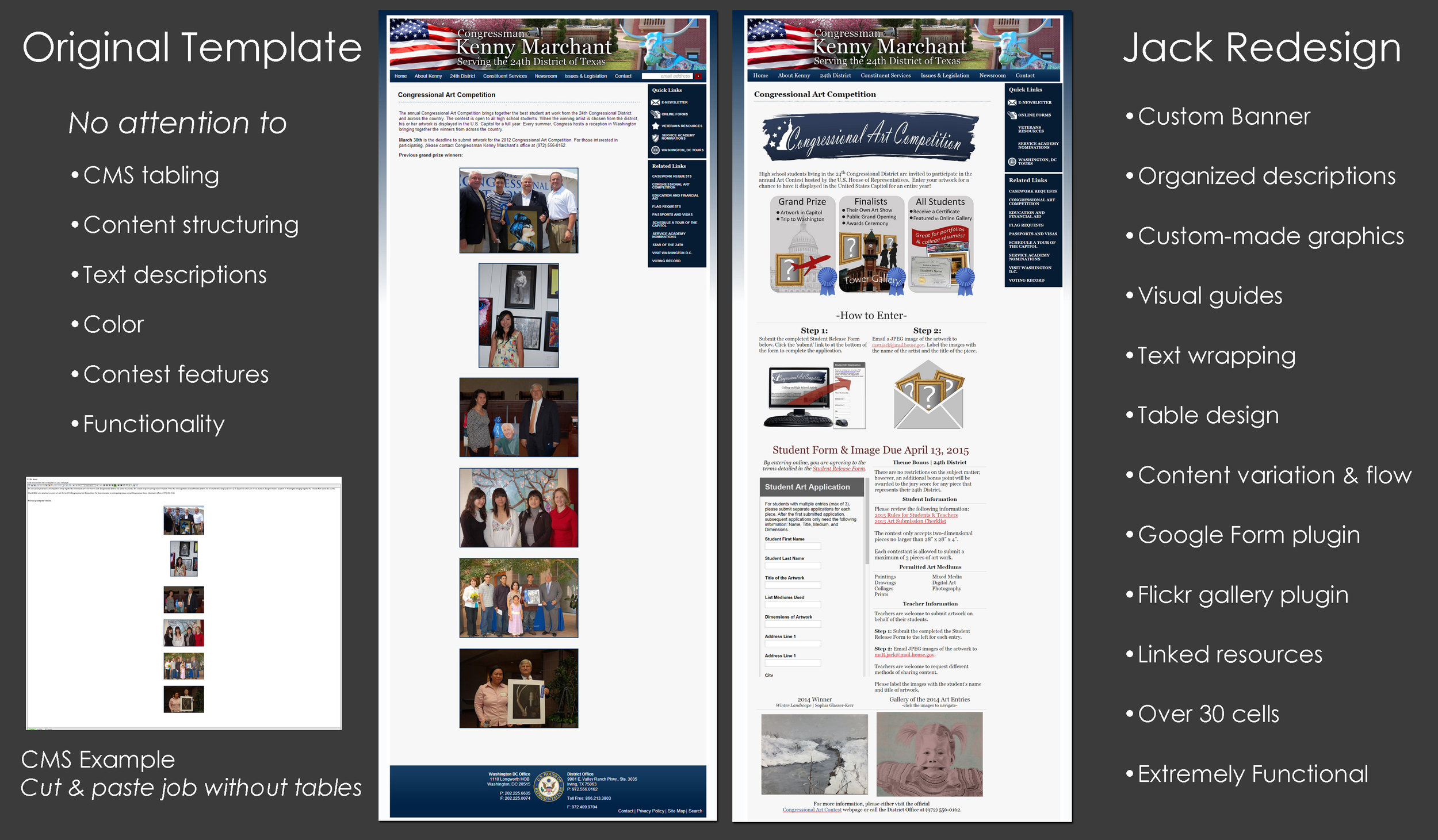
The side-by-side comparison demonstrates the difference between the 2010 CAC page and the 2015 CAC page. Since 2011, I have redesigned and developed the CAC webpage to better help students entering the competition.
In 2014, I received approval to completely revamp the CAC program. The program had historically experienced lackluster participation, and my argument was that entry process was too cumbersome for students to apply. Before 2014, the CAC entry process required students to complete a written form and mail it to the office; additionally, they we responsible for delivering their artwork. I knew that the effort of participating did not warrant the attention and time of young people.
The 2014 revamp was focused on developing a highly functional webpage where students could easily complete the applications online and submit an image of their artwork electronically. The revamp was a huge success. Since 2013, the program has more than quintupled in participation.
Since the website's implementation in late 2009, the homepage had undergone a strange transformation. Without any care, past staff members had used it a pin board for various programs and initiatives. Ultimately, it became a very unattractive discombobulation of information.
In late 2013, I presented the argument to the Congressman that our website was in a poor state in need of a complete redesign. My request was denied because the leadership felt that it would be too much effort for the office; consequently, I counter argued that our homepage could be redesigned to "clean up" and simply the format in a shorter period of time. The Congressman agreed to my plan so long as I could complete it within a short period of time.
I was tasked with the assignment to create a design that could be easily and quickly implemented by our outsourced developers. Using the same dimensions, I created numerous templates. In late October, a design was approved and implemented.
The implementation period was strangely the most arduous period of the project. The developers would overlook errors which I would catch testing the page. Some of the errors included not changing the maxlength text code or making cells a static dimension (the boxes would overlap in Modzilla).
As you'll see in the image above, the PSD file and the current homepage look nearly identical. All of the new icons used we're created by me.
Communicating ideas with web developers to achieve the vision can be a long and difficult task. While low-fidelity wireframes are a quick and efficient way to sketch a design, it can be also be a deterrent for office leadership who are expecting more than collection of drawings. I have created the designs and artwork that have guided web development projects. The following series are designs created from scratch in Photoshop to illustrate an interactive homepage I was trying to pitch.
Latest News - designed in May, 2015
The first interactive tab would highlight the three most recent press releases. The icon would be highlighted in red, while the other four are reverse embossed in grey tones to suggest that they are clickable.
Legislation - designed in May, 2015
The legislative tab organizes content into three columns. The first column briefly outlines the Congressman's committee assignment. The second column uniquely highlights press release published by the committees. The third column will showcase recent votes and include a special search engine for researching bills in the Library of Congress.
The concept of this tab was to ensure that legislative news stayed fresh and relevant without putting too much effort in the communications team which is focused on creating content specially for the Congressman.
District - designed in May, 2015
The interactive map will provide information and links regarding the cities in the district. Clicking a city within the map will change the text to highlight key facts and links.
The map was created in Photoshop.
Veterans - designed in May, 2015
The Congressional office have four unique programs that have earned impressive reputations within the veterans community. To help inform visitors and navigate veterans, we highlighted the programs on the homepage.
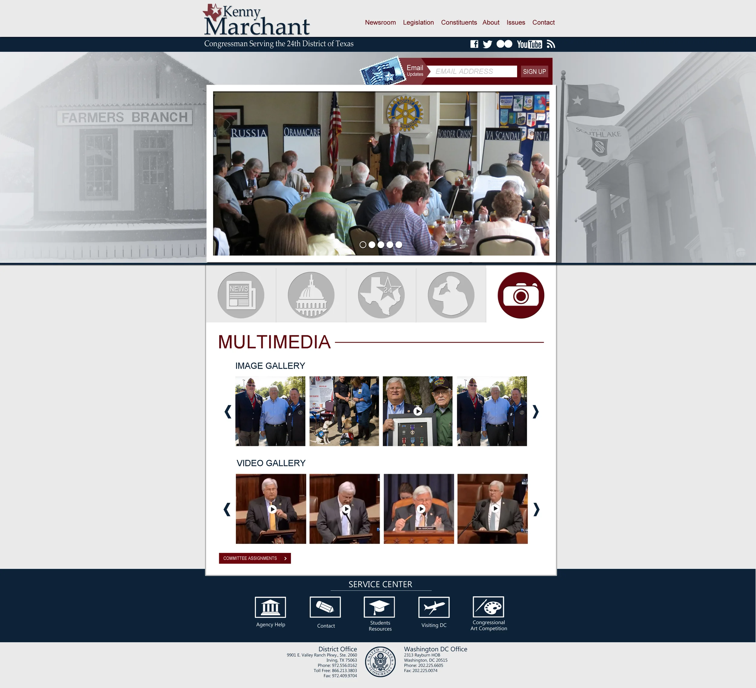
Media - designed in May, 2015
Considered a staple on most Congressional websites are easily accessible media galleries. Rather than have the galleries on the homepage as primary feature, it is nestled away in the tabs. It's important to me that homepages respect color schemes and space, and I find galleries to be disruptive.
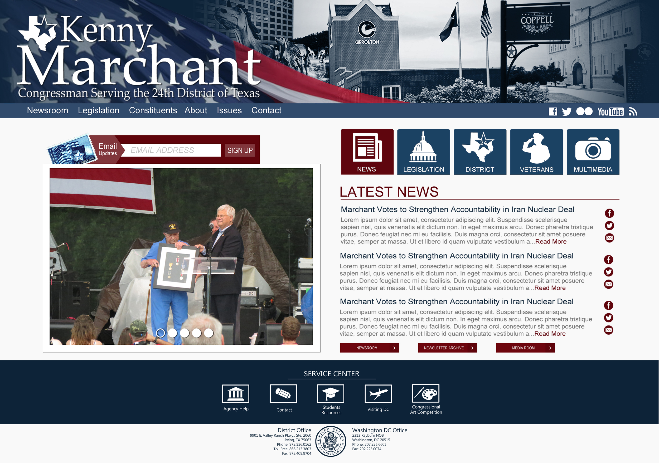
June 2015 Design
Template 2 is a more traditional design, but the look still has a more modern feel while avoiding the industrial chic appearance commonly used today.
I was given the requirement to create a banner that was 1) showcasing images of the district 2) patriotic with an American Flag 3) largely emphasizing the name logo.
That's a lot of content to combine into a banner. I went through multiple designs before creating this image. The biggest obstacle was avoiding an overly busy banner with too many clashing colors.
- Designed and created in 2015
I've learned quite a bit from my mistakes, and one fumble I encountered early on in web designing was creating graphics in one PSD master file. Creating artwork separately allows me to plug and play in the design process; additionally, the graphics are more easily accessible when it comes time to isolating them for we development.
Veterans Fair Mailer - designed in September, 2014
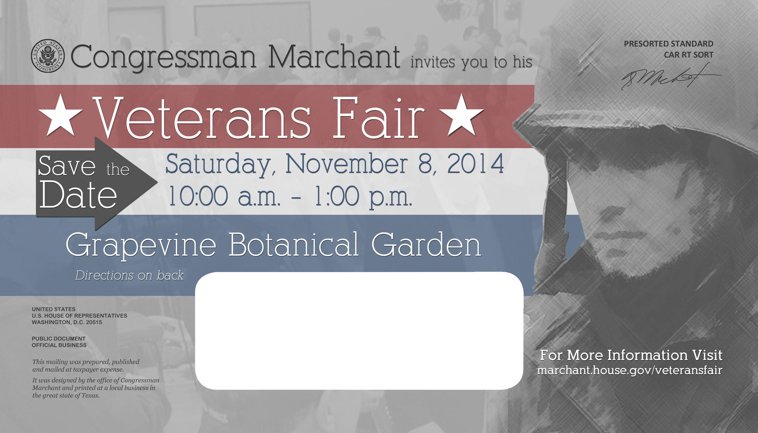
Aside from online publications, I also create print work such 2014 Veterans Fair Mailer. The piece was designed in Photoshop; additionally, the piece meet all of the requirements for print and mass mailing.
Veterans Fair Mailer - designed in September 2014
Mailers need to make a strong impression with little text and a lot of direction. The message on the mailer was designed to emphasize the attractions while providing guidance on the event location.
I created the map to highlight key highways and intersections to assist our targeted audience of veterans.
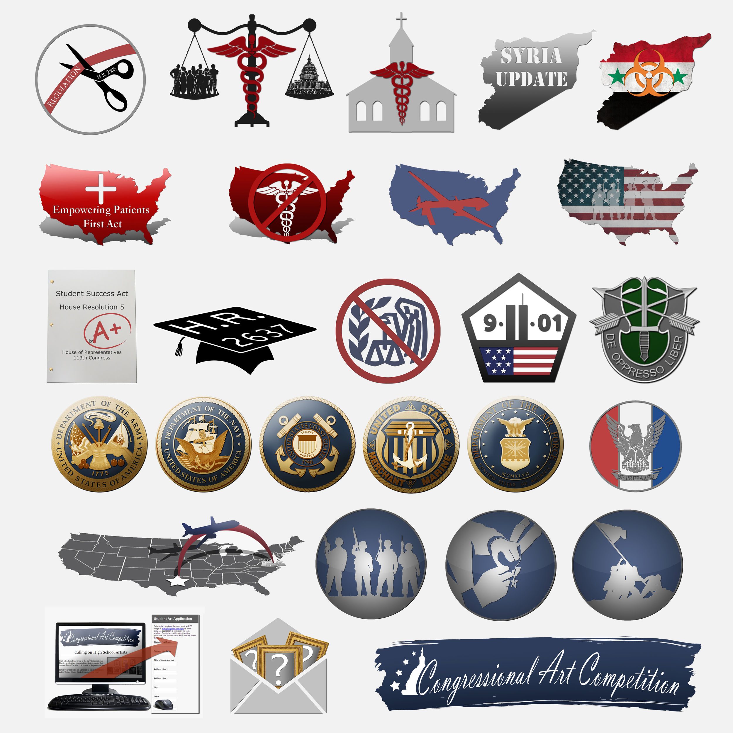
Above is a collection of various graphics I have created in Photoshop for news stories or office programs. While some of the graphics are made from scratch, many of the graphics were developed from images that I lassoed and rendered.
I'm sure it's noticeable, but I have a particular style that I've developed over the years. I like to layer images in a manner where I can create a modern 3-dimensional feel. While I do appropriate the current 2-D fad, I really enjoy playing with depth when creating artwork.




In early 2013, I was tasked to redesign the e-newsletter after constructively arguing that the original template was outdated and poorly structured.
The objective was to make the content easier to read and more appealing to the audience. My primary goal was to eliminate the off-centered negative space, and restructure the content into a newspaper format where stories were neatly organized into tables.
I was no surprise that once I entered the CMS program, that the template was absent of tables. The content was merely being copied and pasted into a single cell.
The redesign was a successful project, and the concept is still used today. I have instructed all of the communication staff members on how to use HTML tables, and established an expectation of excellence since implementation.